Notifications display improvement

Greetings,
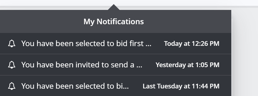
The notification title should be more readable. I mean, right now, in the current notification preview (see attached), there should be just an icon or something that would take one-word space to define it's a "free bid job" and then the title of the job, it'll be more effective to directly see a part of the job title.
Right now we can just see that at x time I've got a notification about "free bid job"... but can't define which is what... so I think we really need to improve that.
Please sign in to leave a comment.
Comments
0 comments