NEW PROJECTS PAGE IS NOT LOOKING GOOD

Dear, PPH Team
I am new to PPH but when I started and navigated the pages while working on bidding, I found everything very easy and user-friendly until the recent update in the search projects page which looks like Upwork projects page and is not at all appealing in any way to my opinion only...I think the earlier page is unique, very simple, and clear with the project listing and their prices....I think everyone can simply click the job post to see the description and that way one can properly go through the job details whereas now it's looking very messy and lengthy.
I have just shared my views as I like working on PPH.
Thanks,
Atul
-
Official comment

Thank you for your feedback - we really appreciate you taking the time to share this suggestion with us. We'll raise this feedback with our product team to make aware and to review going forward. Thanks!
Comment actions -

I completely agree. It is modelled on Upwork, and I don't consider Upwork to be worth copying in any way.
I have a fairly big screen and I can only see 3 jobs on the screen without scrolling. I rarely need the description to know I'm not interested in the project. I'm usually just scanning for certain words in the title, and skipping over anything that is clearly not in my field. It used to take very little time to look through the last 24 hours of postings, and I didn't miss anything.
The filters down the side are completely pointless. I don't care whether the job is "Entry", "Intermediate" or "Expert" because the buyer hasn't got a clue what to put there and it is meaningless. It is similar with the other filters. There are not enough projects to need a filter, if they were pushed a bit closer together on the page. Even when the platform was a lot busier than it is now, it didn't need a filter. -

Hi folks,
Thanks for the feedback. I see what you mean, there are a lot less Projects shown now in a given screen, without scrolling.
I think it might not be as good for power users like yourself but hopefully it's nicer for newer members. There’s a larger click target for each Project for one.
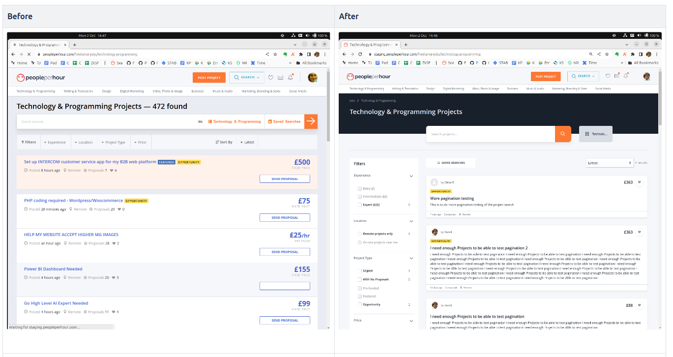
For reference, here's the Before and After Screenshot:
-
Hi Tom,
It is always good to know that someone is taking an interest. I won't dispute that the redesign looks nicer, but I feel it is less effective, and the similarities to Upwork do make me cringe.
I wouldn't describe myself as a "power user", although what I do here is what I do for a living, so I am checking the projects daily. I usually have PPH open in the browser so it will ping me if there is a message or a job match. I'm starting to stop this now, because the work has dried up to the extent that I know I need to focus my efforts elsewhere. A new member doesn't know the situation and thinks there are a lot of projects to apply for. In reality, you can ignore anything that is more than 2 or 3 days old, and it doesn't take much to scan through the last 2 or 3 days of posts and look for something in your chosen field. -
If I'm being honest, one reason that we now show some of the Project Description text is that it means the pages are richer in keywords which means Google will be more likely to include us in their search results. If we can get more people to find us, we might be able to get more Projects on the website, and that'd be better for us all. I'm sorry if this decision comes at the cost of usability, in terms of having to scroll more.
The "Saved Search" feature allows you to define a search that will email you if Projects match in the future. This way you might not need to monitor the Project Listings page so much.
Pro tip: I like to set up a Saved Search for Pre-Funded Projects because Pre-Funded Projects mean the Buyer has a payment method confirmed to be genuine, which is a good filter to weed out time-wasters.
-
Thanks.
By the way, I can put my hand on my heart and honestly say I never even considered Upwork. I can see the similarity though TBH. We were trying to bring the page in line with our other 2 listing pages (Freelancer search and Offer search) which took their inspiration from AirBnB I think. By using the same UI look and feel across all 3 search pages we were able to reduce the page size a fraction in terms of download size for the Browser.
Please sign in to leave a comment.
Comments
7 comments