Dashboard design changes

Hello,
Let me thank you first for taking the time to redesign the dashboard.
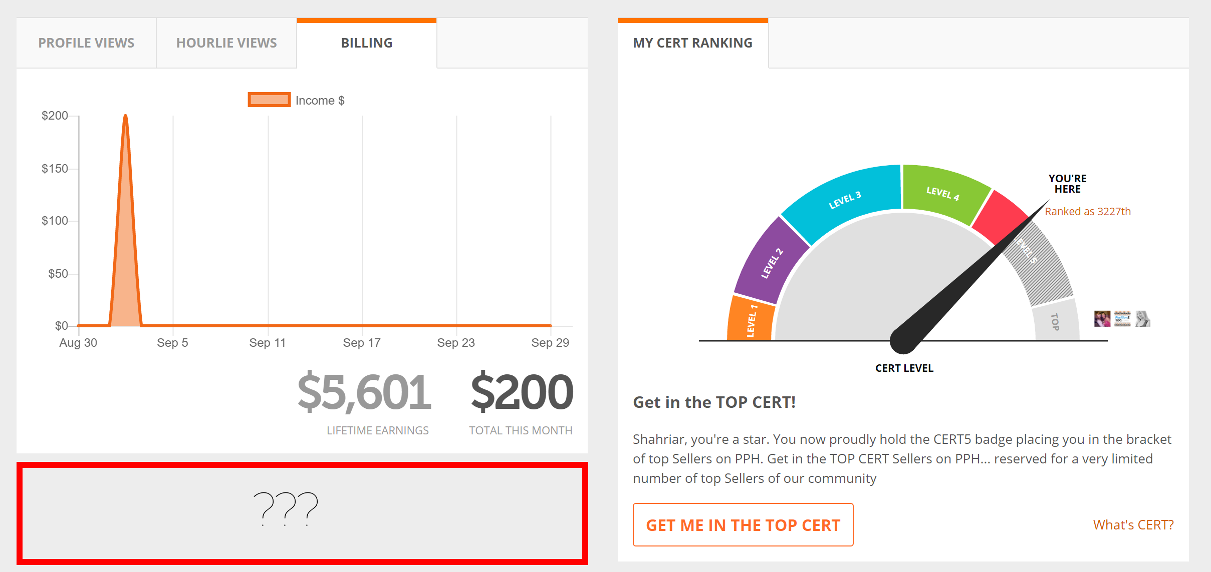
There is one thing that I currently find distracting about the dashboard, please see the screenshot I think it's self-explanatory.
Let me know your thoughts about this one.
Other than this, I absolutely LOVE the new design, this is a change that makes much more sense.
Regards,
Shahriar
-
Official comment

 Comment actions
 -

The dashboard design is great but PPH usability is not good. Where is the uninvoiced hourlie section?
that was the most important section as from that section we know that which projects we were working on which are still left raising invoice?
Also in hourlie views some of the hourlies dont show up.
Where are all unread message section?
At the top of the page it shows me 200+ WORKSTREAMS IN-PROGRESS?
-

Hello,
It has been more than 2 weeks since I am facing an issue in my PPH account, the dashboard is not appearing fine as it is supposed to be. It is showing nothing on the dashboard page, rest of the pages are working fine.I am also sharing the screenshot of the issue in the attachment, for you to see how the dashboard page is looking completely blank.
I would request you to please have a look on this issue quickly and update me as soon as it is resolved.
Best regards,
Praveen

Please sign in to leave a comment.
Comments
4 comments