New looking of hourlie posts

Hello,
I would like to give a feedback as a seller on PPH since 6 years ago and still an active seller everyday until now.
I noticed that hourlie posts appearance has changed signifantly and I noticed that my hourlie post has no selling power anymore by this appearence update.
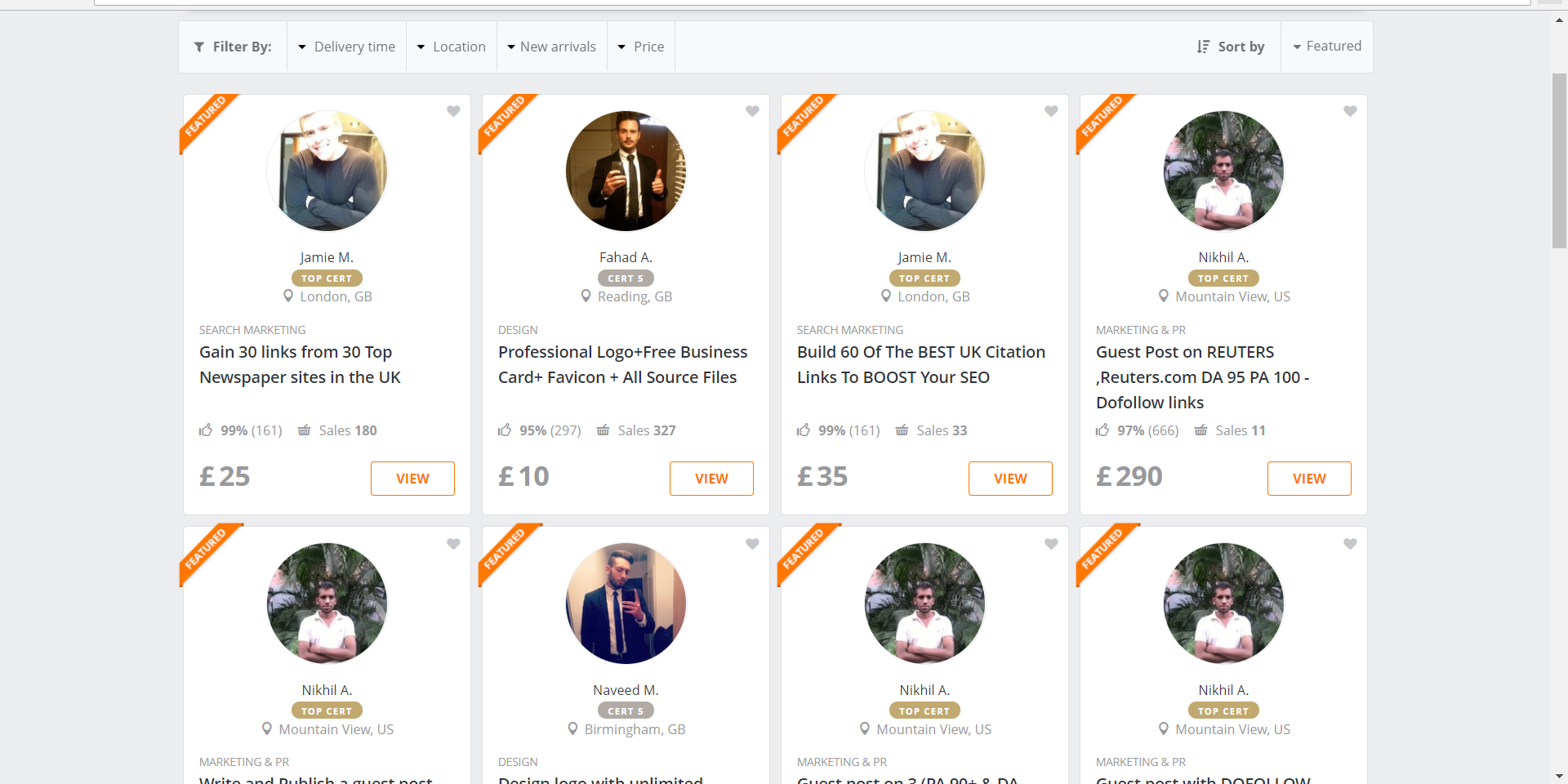
Below I sent a screenshot of how hourlie posts appearing on screen on recent website version, it no longer showing thumbnail of the hourlies instead it showing profile picture of the sellers and this way I am 1000% sure people/buyer are lazy to read a bunch of hourlie titles one by one.
How if those sellers also selling the same services like what I have to offer? Without thumbnail it is hard to differenciate which hourlie offering the best between those thousands of hourlie with almost the same titles. For example me as an artist it is important for buyer to see what cartoon style I have to offer.
It was best with thumbnail of the hourlie because it was easy to attract potential buyers to click the hourlies and finally end up to buy one and also people are normally just scrolling up and down down and click the one that catched their eyes because it looking attractive. But now, by showing only profile picture and I am not sure that my profile photo is strong enough to attract buyers to click on my hourlie.
I wish this hourlie thumbnail would be back again like ever.
Kind Regards,
Tri
-

Hello, I also agree that the new look is a bad decision. I mainly work as a freelancer who sells on PPH but I also viewed the hourlies as a buyer for outsourcing work and it is now much harder to differentiate between hourlies. This new look is boring and does not make me want to click on any, I'm sure its the same for many others.
I would like a response from PPH as to why they have changed the layout in the first place.
Mike


Please sign in to leave a comment.
Comments
4 comments